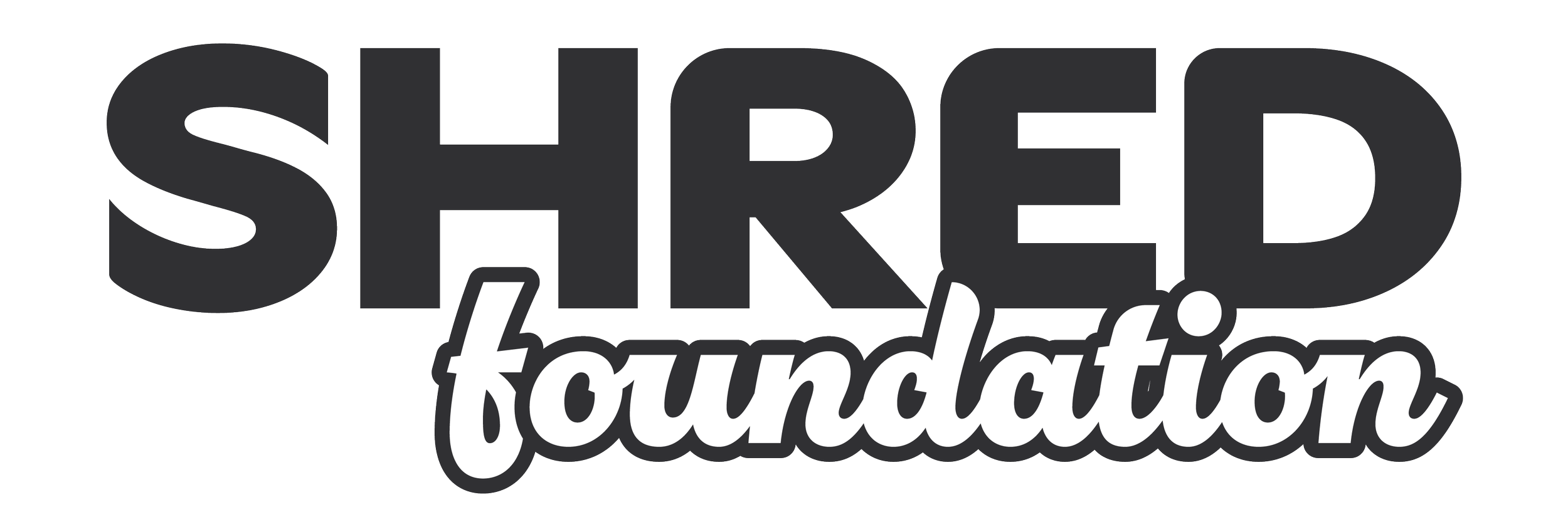
SHRED Foundation is a non-profit organization that strives to gear underpriviliged youth with the tools to succeed and perservere over adversity in their everyday lives through the lens and mentality of snowboarding and skateboarding.
THE STORY: SHRED is a nonprofit organization in the Capital Region that focuses on providing career opportunities to kids in their snowboarding program. The goal is to give the kids an experience that they can enjoy while giving them career opportunities in a sport they are interested in. Similarly, SHRED took over an indoor skatepark in Albany with the goal of incorporating a program for skateboarding as well. Due to various reasons, the skatepark component was unable to survive, and SHRED hopes to revive this component in the coming years. As a skateboarder and patron of the park at the time, I spoke with SHRED Founder, Danny Hairston, several times regarding the hopes for the future of the park and for SHRED, which opened the discussion around transforming the brand.
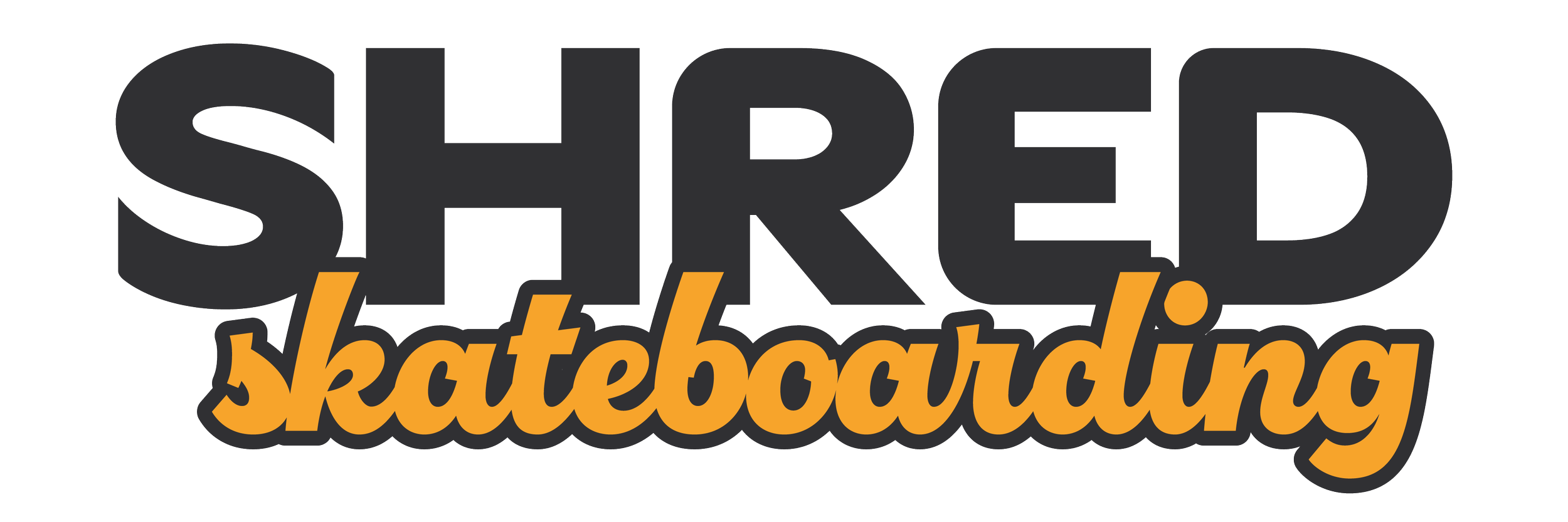
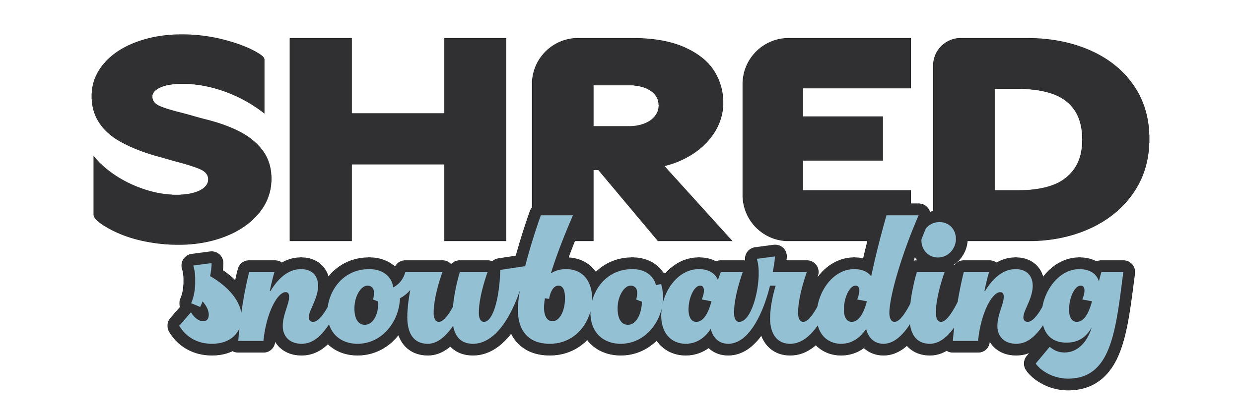
THE PROJECT: In 2025, I partnered with SHRED to connect and discuss how the brand can proceed and break out of the then-current concept that SHRED is simply a skatepark. The goal therein was to create a brand that had three key components: 1) Identifying SHRED as an organization with a focus on making an impact, rather than simply a company that owns a skateboarding complex, 2) Revamp the brand visuals to reflect this new brand personality and messaging, and 3) Separate the elements of the SHRED Foundation, Skateboarding, and Snowboarding into sub-brands that all tie together.
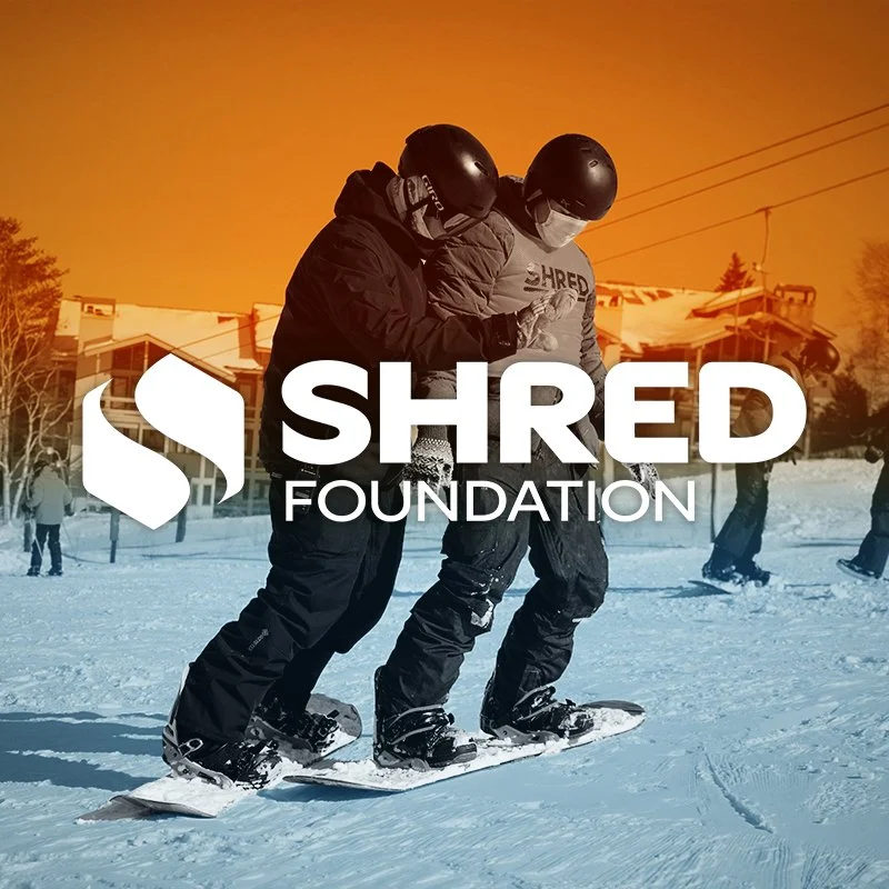
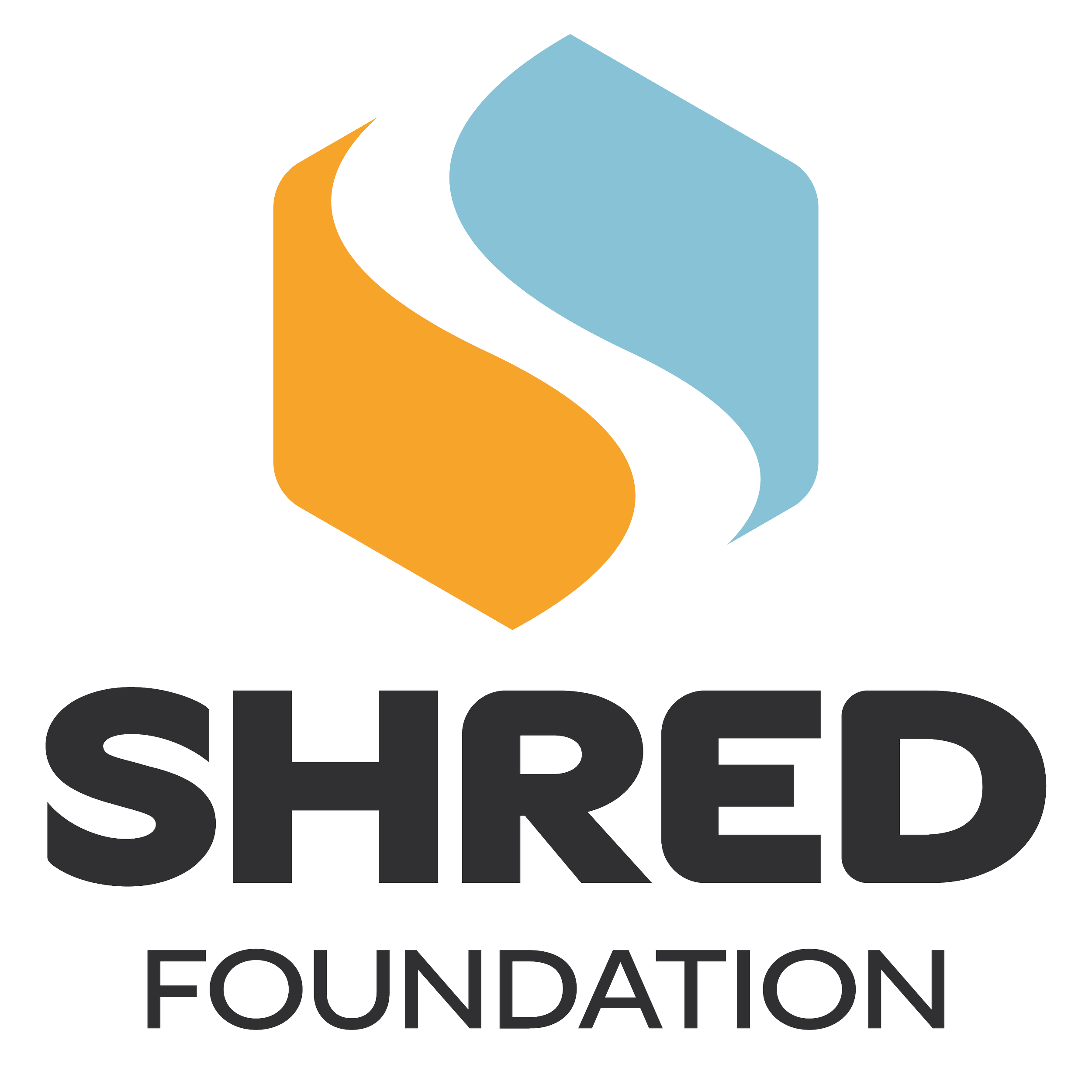
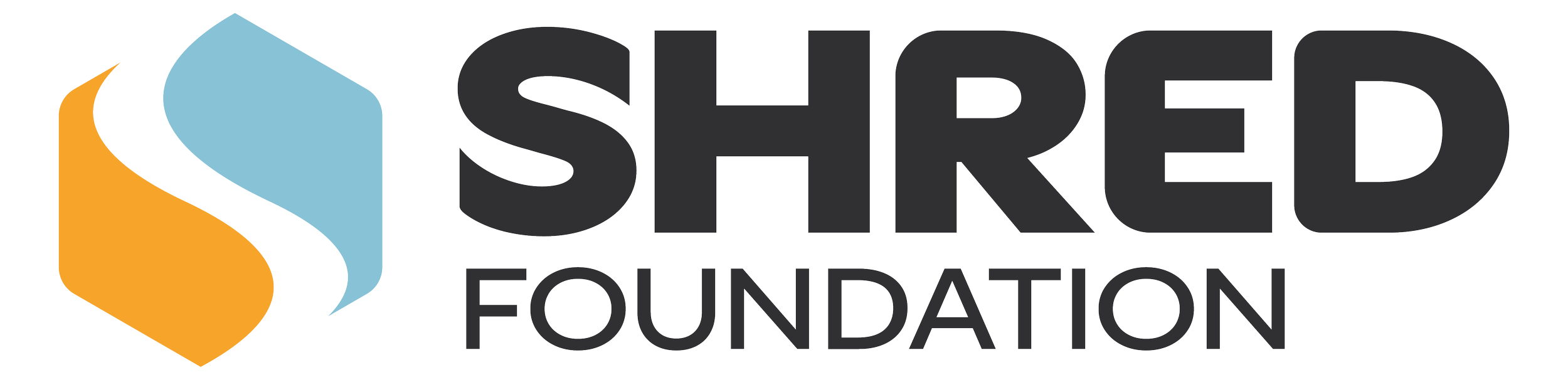
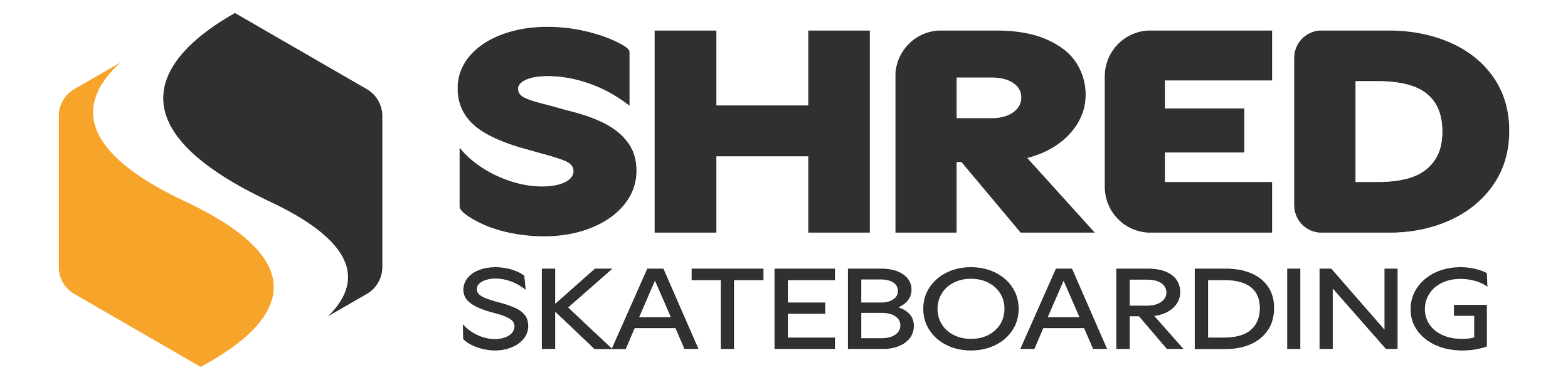
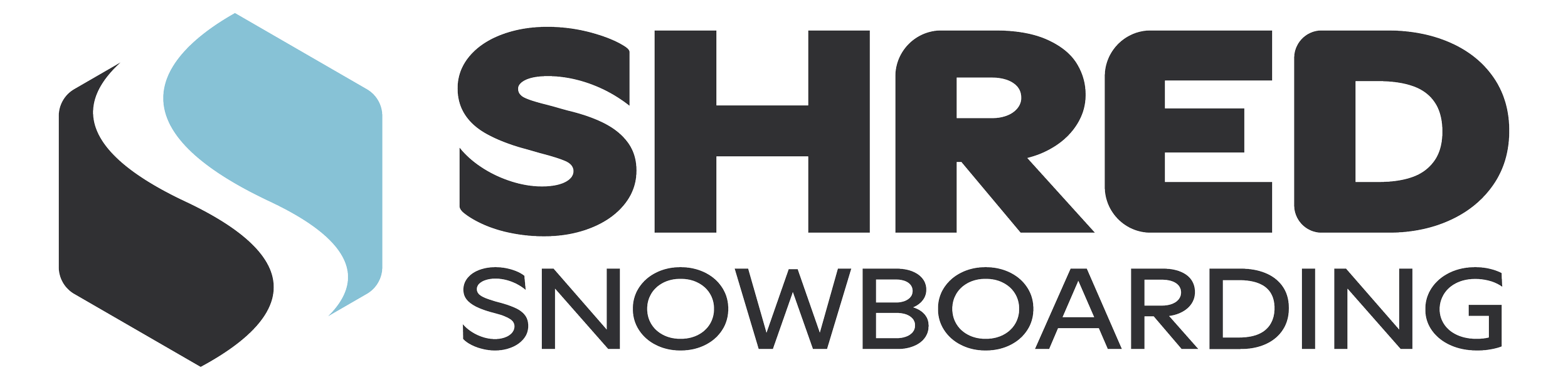
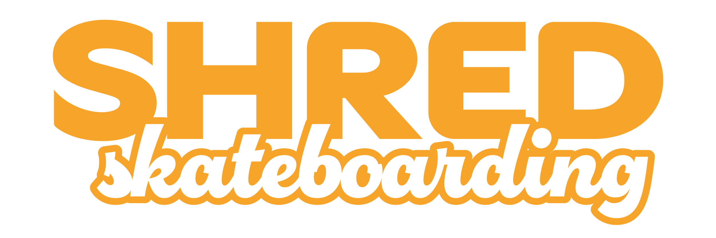
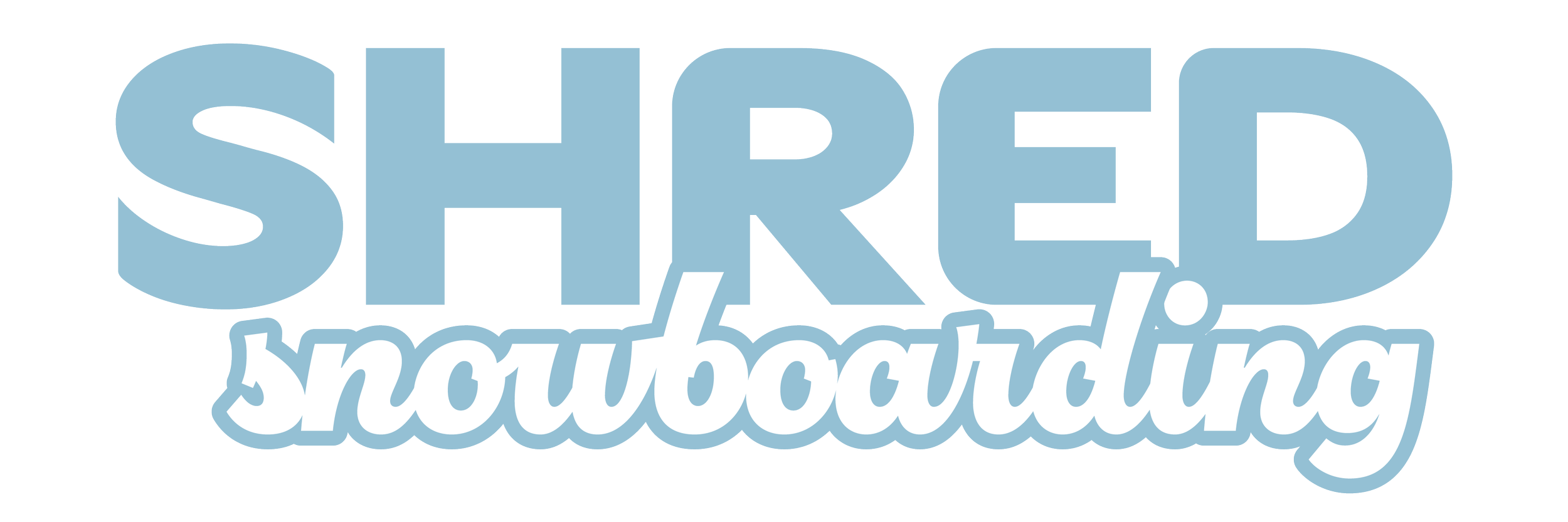
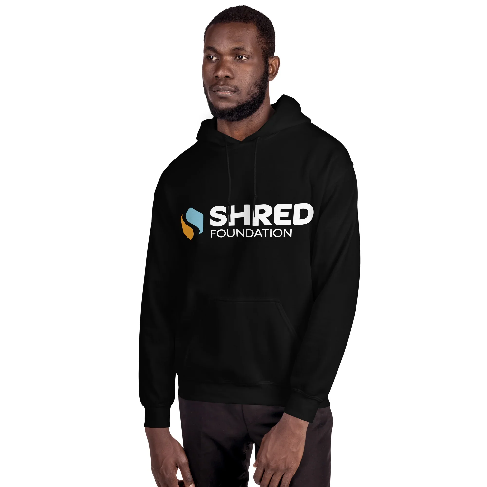
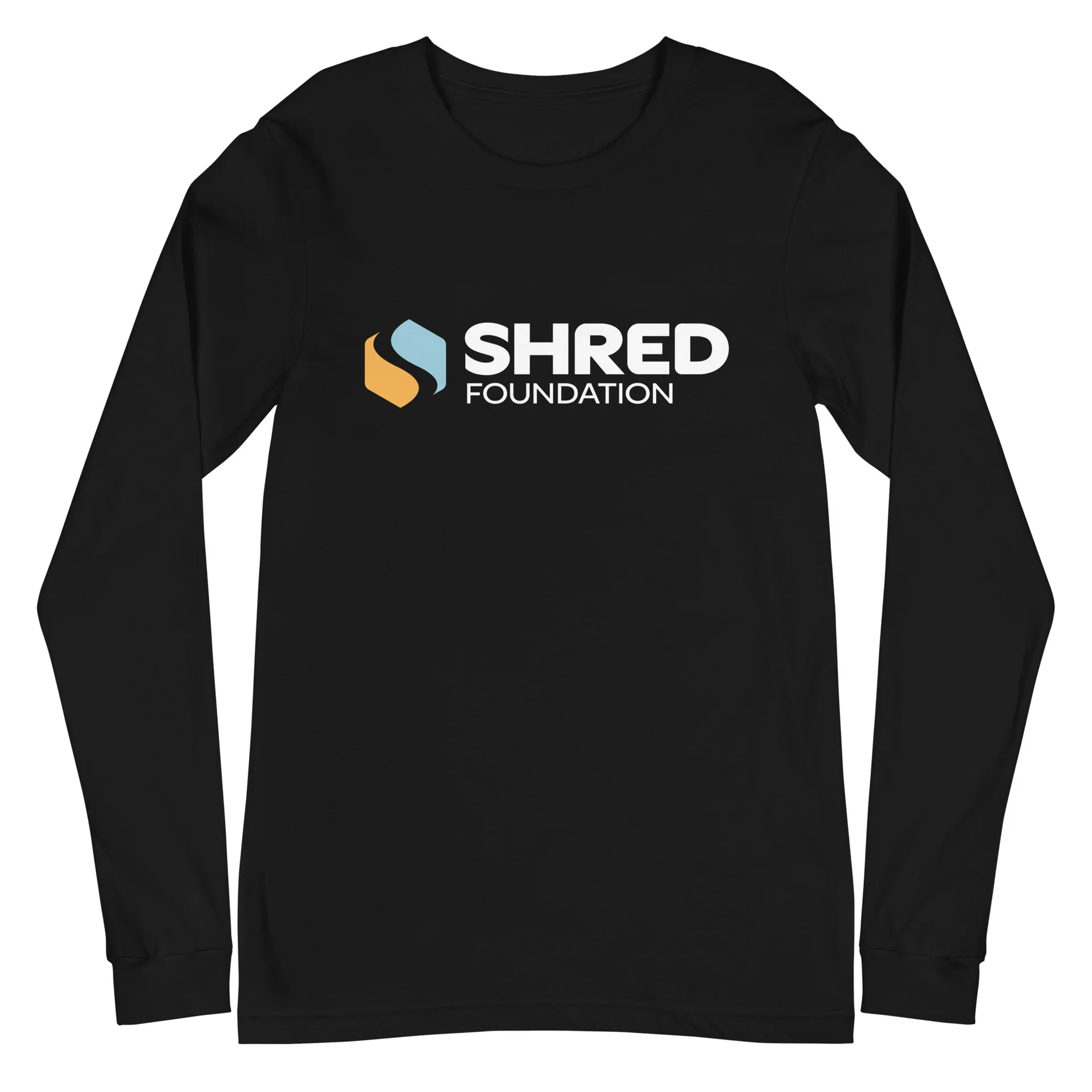
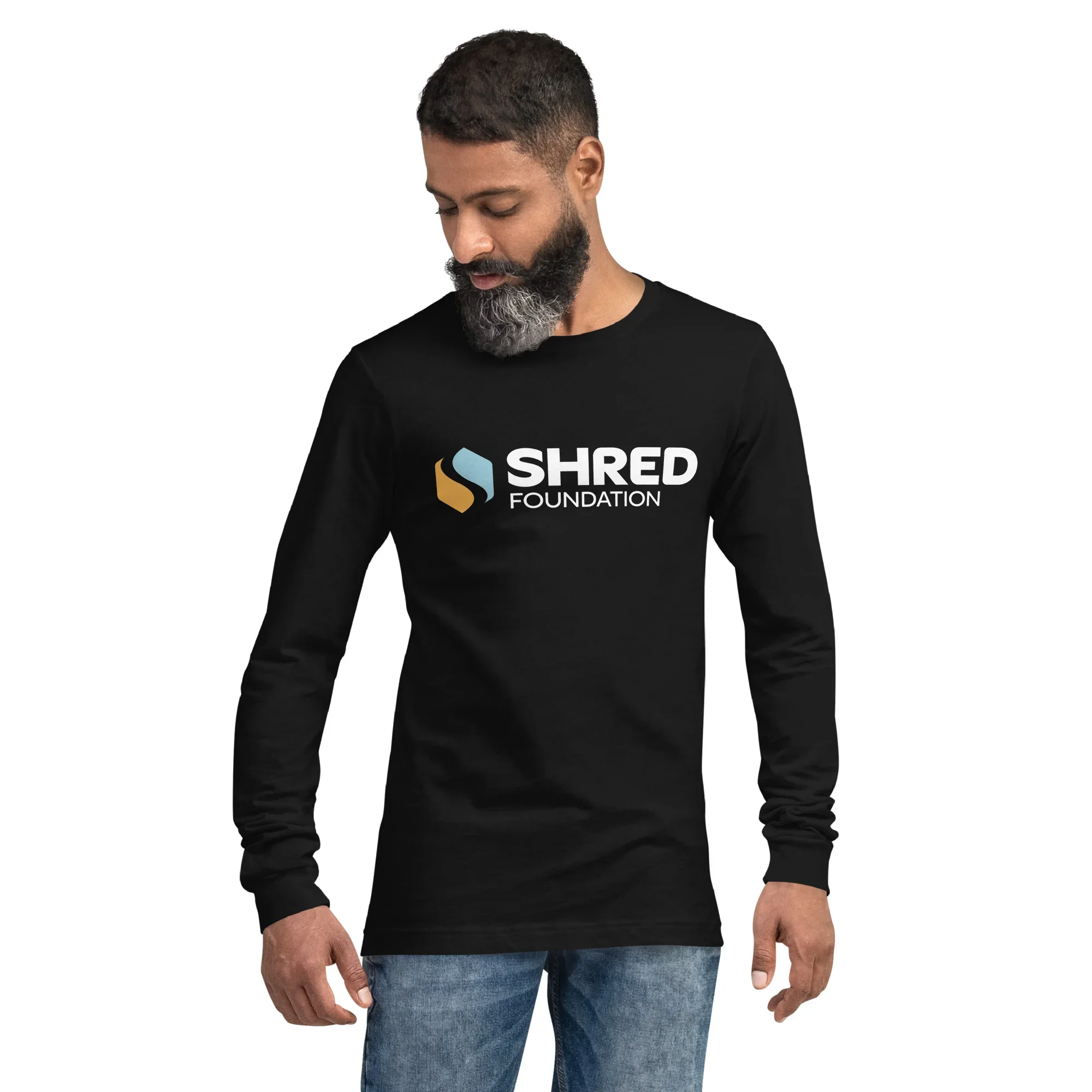
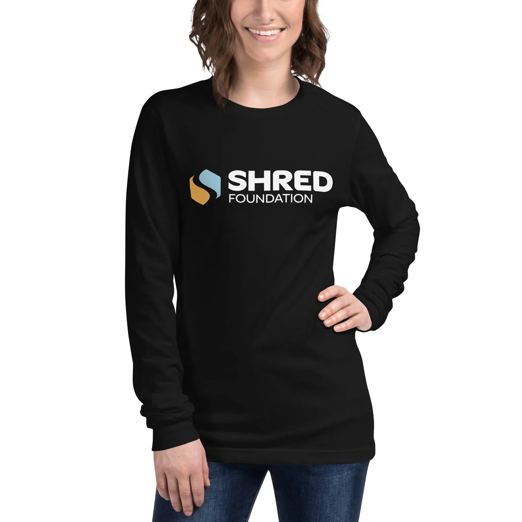
THE CREATIVE: I recognized the opportunity for there to be a hidden knockout “S” shape that divides the mark into two, which perfectly solved the matter of splitting the brand into it’s subdivisions for Skateboarding and Snowboarding. To visualize this split, I chose to incorporate two colors, one for each subdivision. Naturally, I chose a warm summer tone for skateboarding and a cooler winter tone for snowboarding. With the color separation, the brand can function as Foundation (having both colors in the logos), Skateboarding (having only orange variations in the logo), and Snowboarding (having only blue variations in the logo).
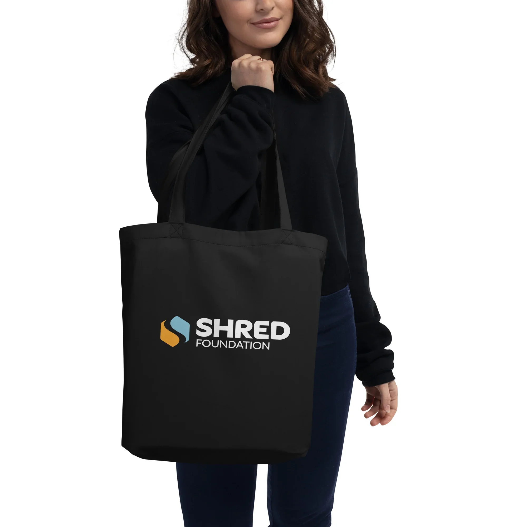
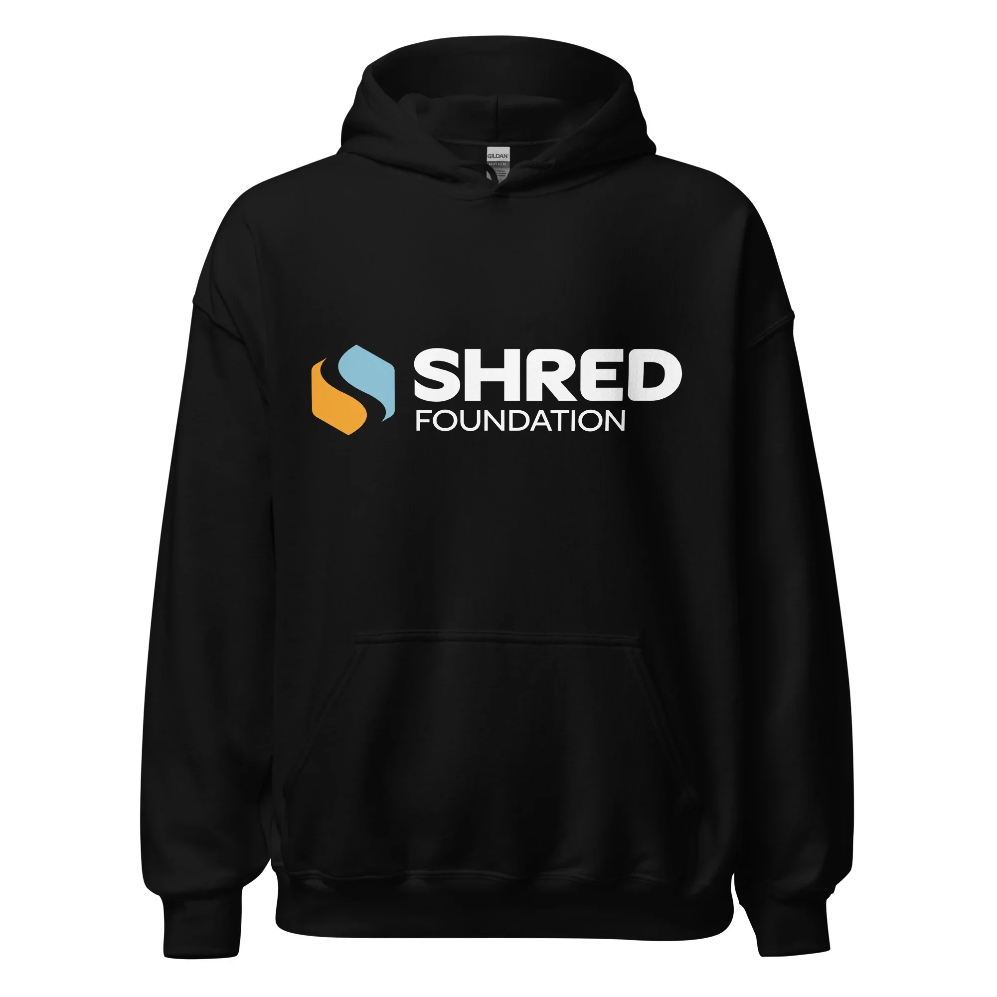
THE RESULT: A revamped and refreshed identity for the brand, subbrands for the Skateboarding and Snowboarding division, and updated visuals that better align with the duality of the brand, promoting the Foundation first, and the skate and snow divisions second. The rollout for this project is still ongoing, with imagery and logo/photo treatments to complete the project coming in the near future. Below are some real merch products created to soft-launch the new branding.
MY ROLES: Art direction, brand & visual identity, logo design.